SAC R-Visualization#2
SAP Analytics Cloud R-Visualization
Gauge Chart
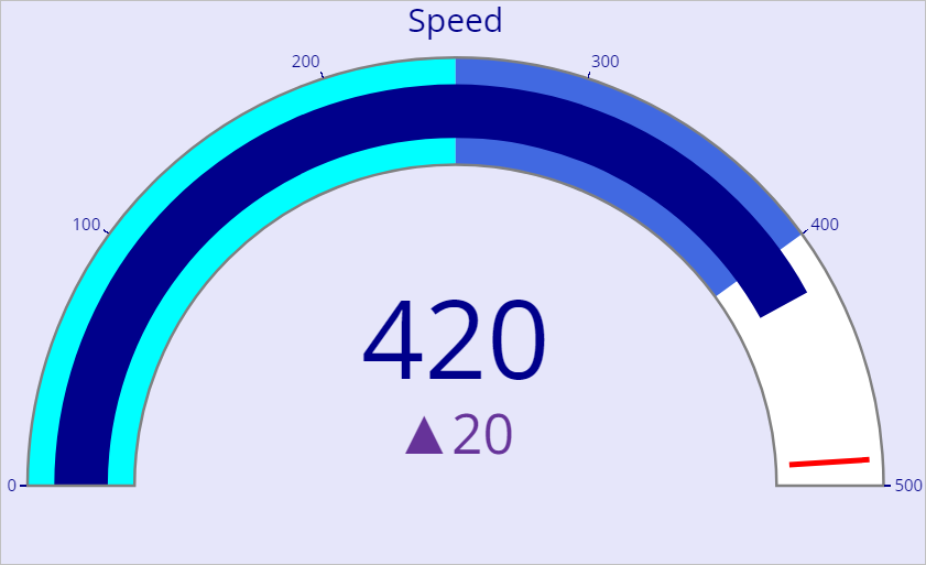
library(ggplot2)
fig <- plot_ly(
domain = list(x = c(0,100000), y = c(0,100000)),
value = select model$ 'variable',
title = list(text="Give your Title"),
type = "indicator",
mode = "gauge+number+delta",
delta= list(reference=80000),
gauge= list(
axis = list(range= list(NULL,100000), tickwidth=1, tickcolor="darkblue"),
bar = list(color= "limegreen"),
steps = list(
list(range = c(0,40000), color="darkslategrey"),
list(range =c(40000,80000), color= "cadetblue"),
list(range =c(40000,95000), color= "darkturquoise")),
threshold=list(
line= list(color= "red" , width =4),
thickness=0.75,
value=95000)))
fig <- fig%>%
layout(
margin =list(l=50,r=50),
font = list(color="Black", family =" Arial"))
fig
fig <- plot_ly(
domain = list(x = c(0,100000), y = c(0,100000)),
value = select model$ 'variable',
title = list(text="Give your Title"),
type = "indicator",
mode = "gauge+number+delta",
delta= list(reference=80000),
gauge= list(
axis = list(range= list(NULL,100000), tickwidth=1, tickcolor="darkblue"),
bar = list(color= "limegreen"),
steps = list(
list(range = c(0,40000), color="darkslategrey"),
list(range =c(40000,80000), color= "cadetblue"),
list(range =c(40000,95000), color= "darkturquoise")),
threshold=list(
line= list(color= "red" , width =4),
thickness=0.75,
value=95000)))
fig <- fig%>%
layout(
margin =list(l=50,r=50),
font = list(color="Black", family =" Arial"))
fig

Comments